

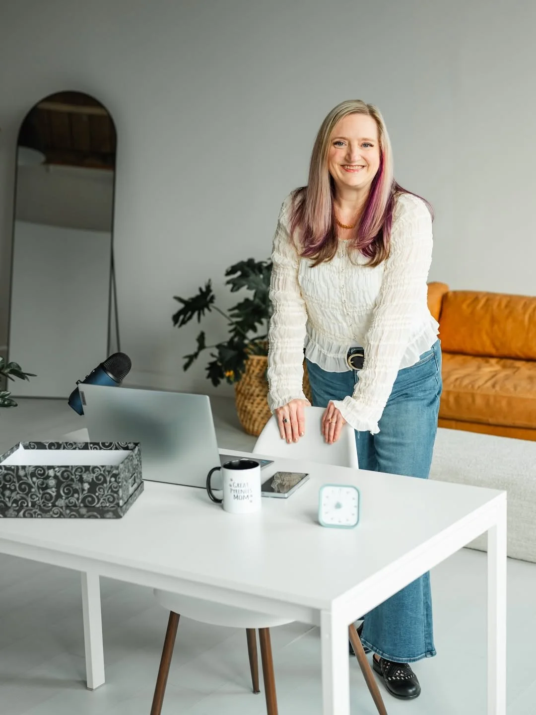
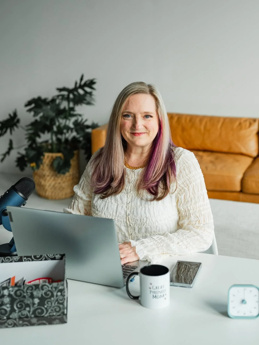
Lorinda is a registered nurse with 30+ years of experience and an ADHD Organising Specialist who has lived the exact struggle her clients come to her with. She knew her worth. She just needed a brand that finally showed it.
The brief was a tricky one in the best possible way. Her brand needed to do two things at once: signal real clinical credibility, and feel warm and safe enough that women carrying shame about the state of their homes would actually feel comfortable reaching out. That's a big ask of a visual identity. But that's exactly what strategy is for.
The Brief:
-
Brand Design
Brand Strategy -
FEBRUARY 2026
-
Boston, USA
The Outcome:

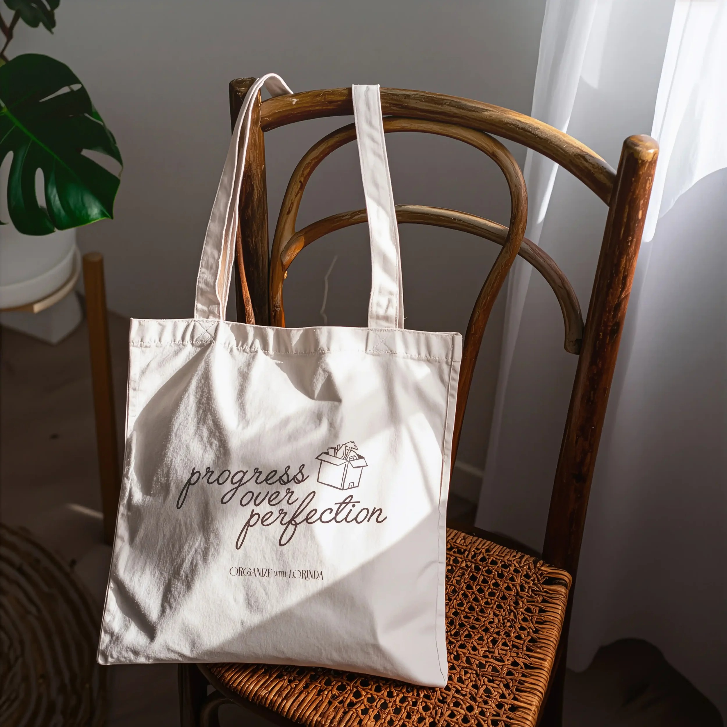
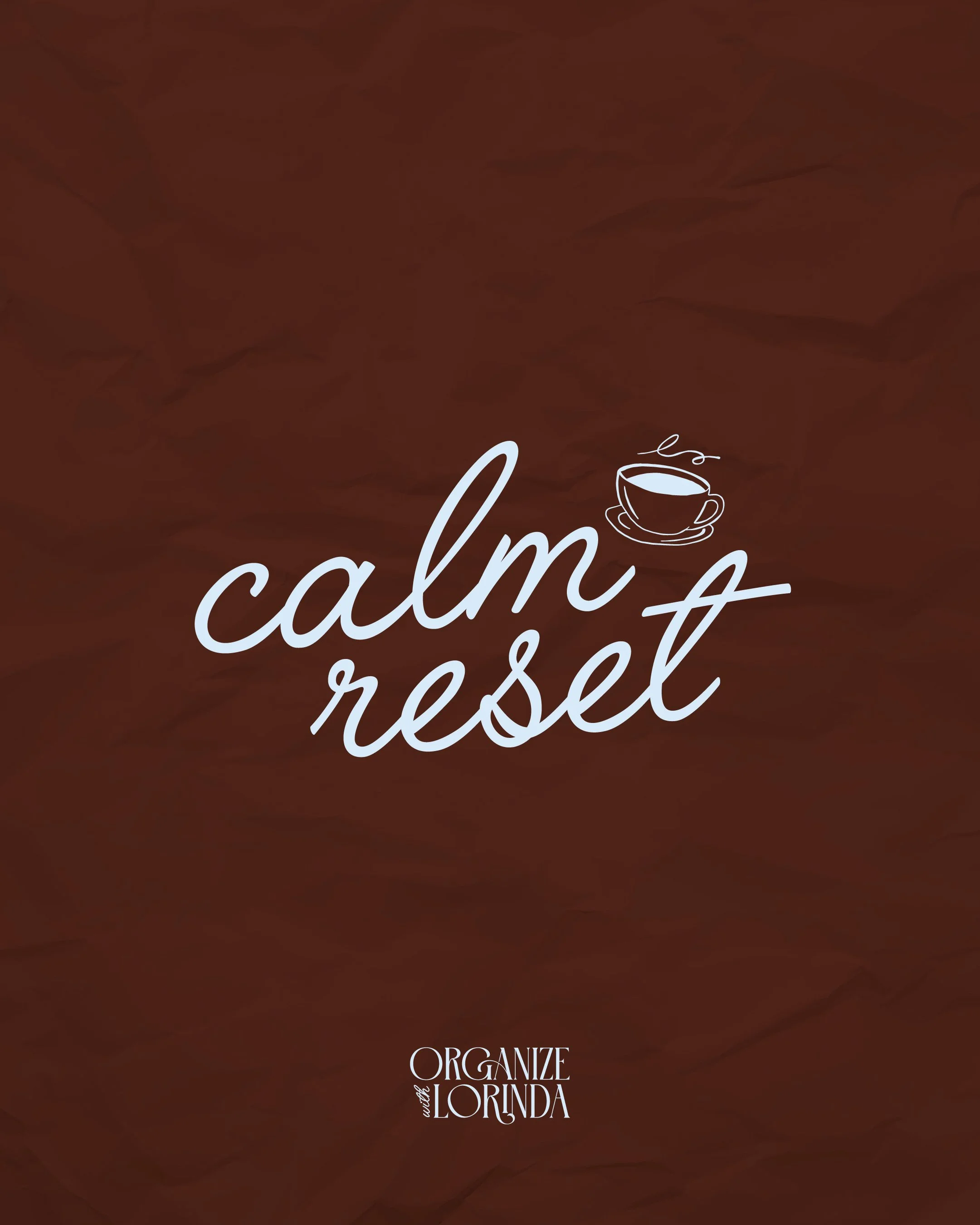
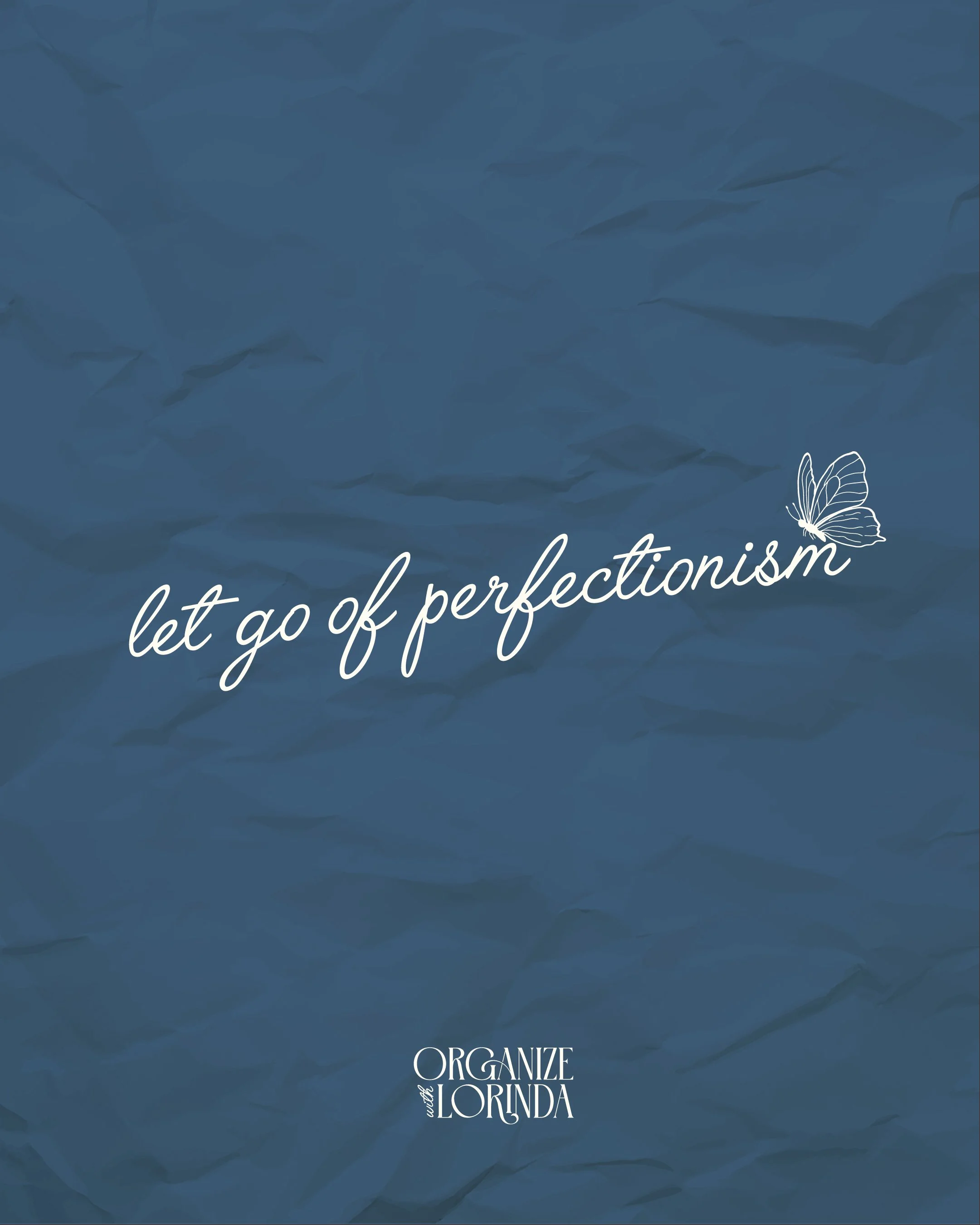
Every decision in this brand was intentional. The custom illustrations, a butterfly, dragonfly, vintage key, coffee cup, lamp and box, aren't just decorative. They pull at something emotional, because asking for help with your home can feel exposing and vulnerable, and we wanted every visual to quietly say you're safe here.
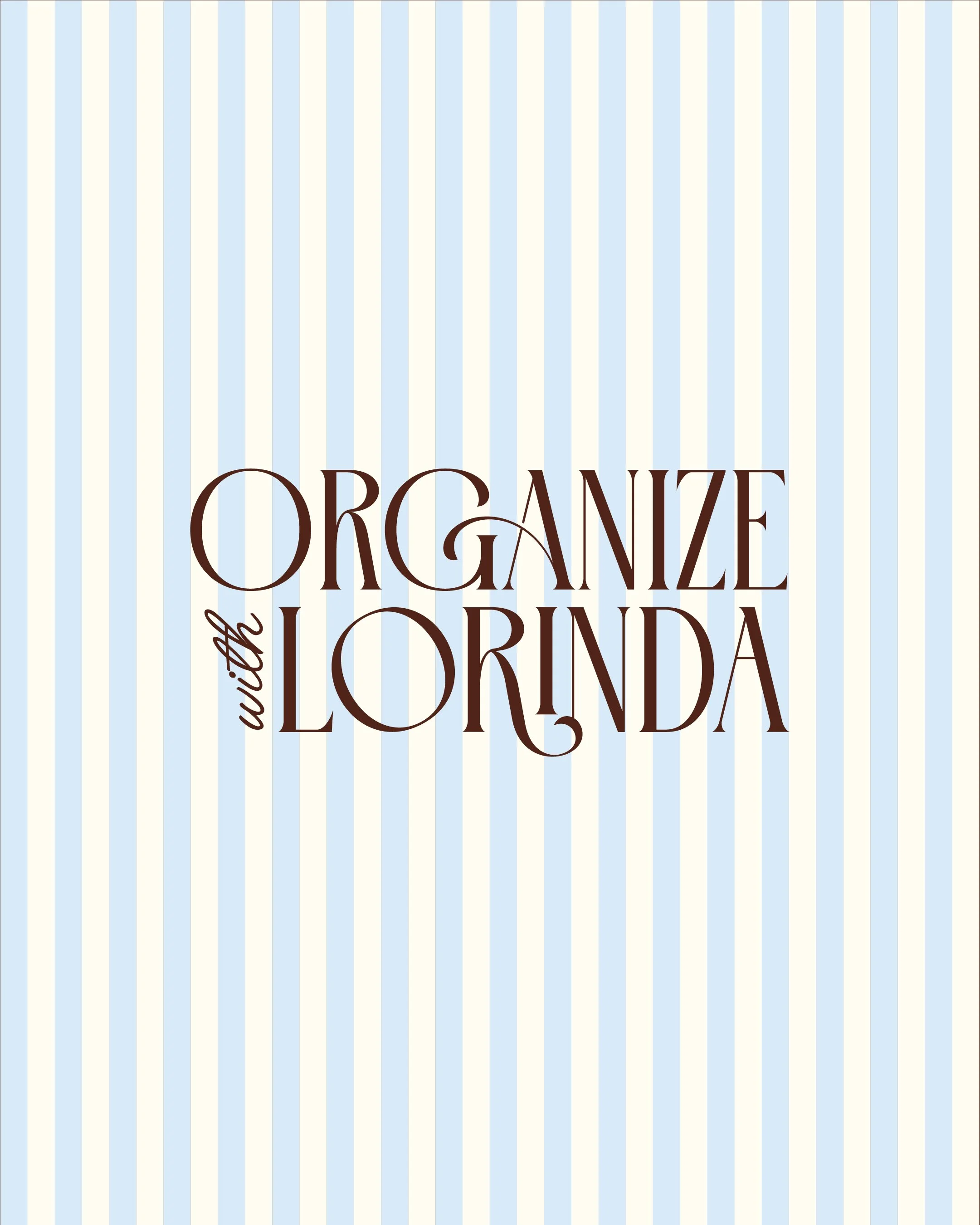
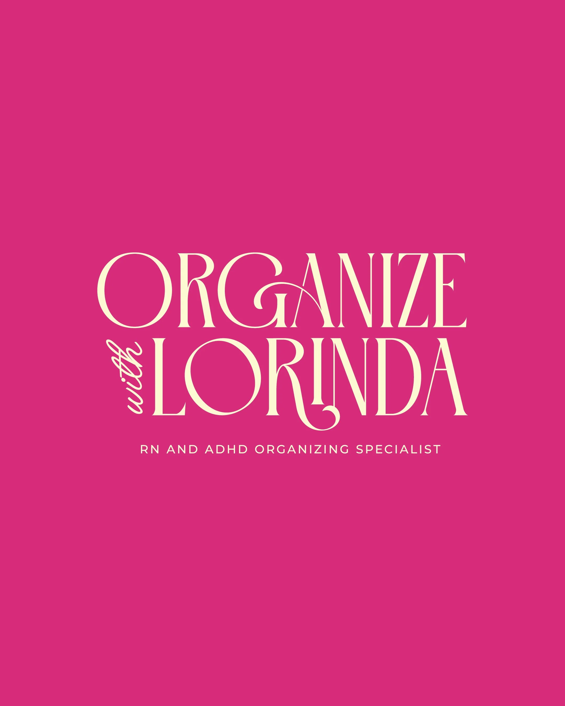
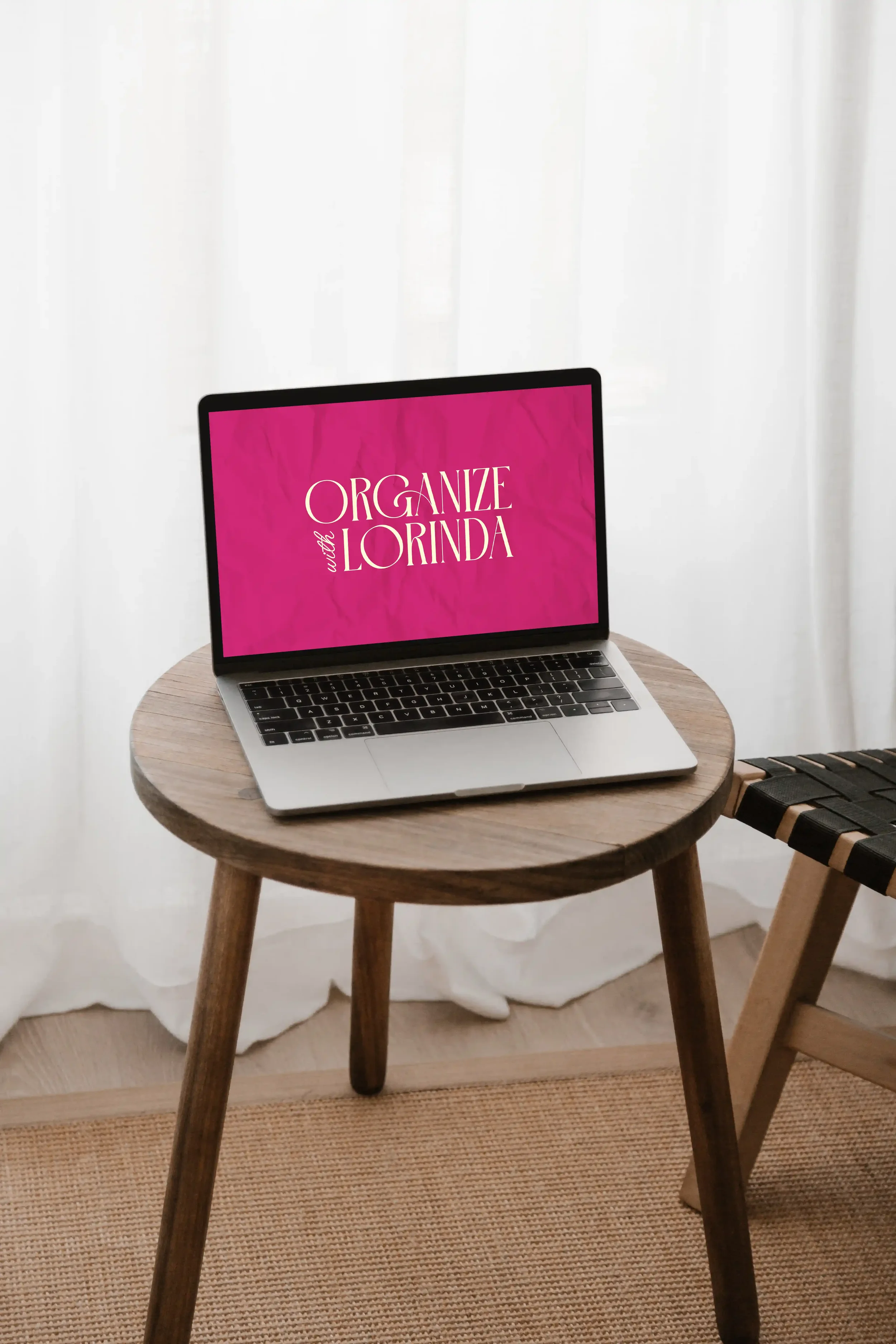
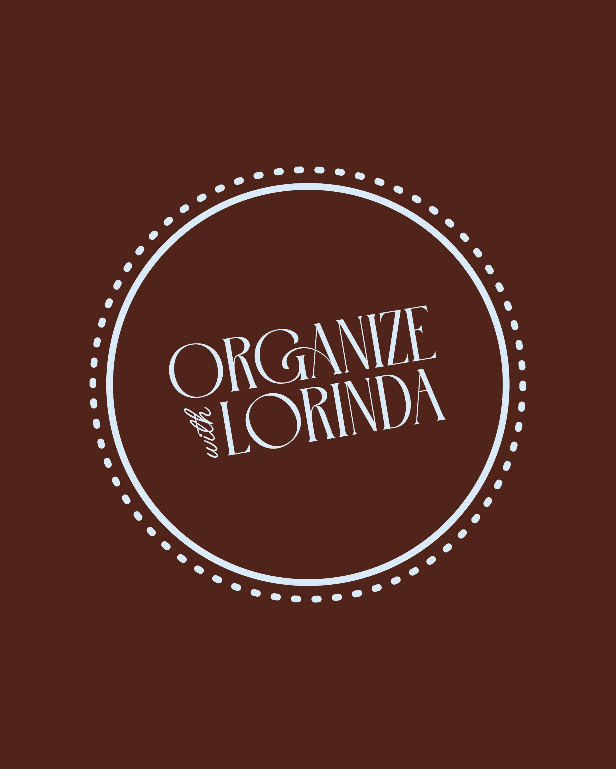
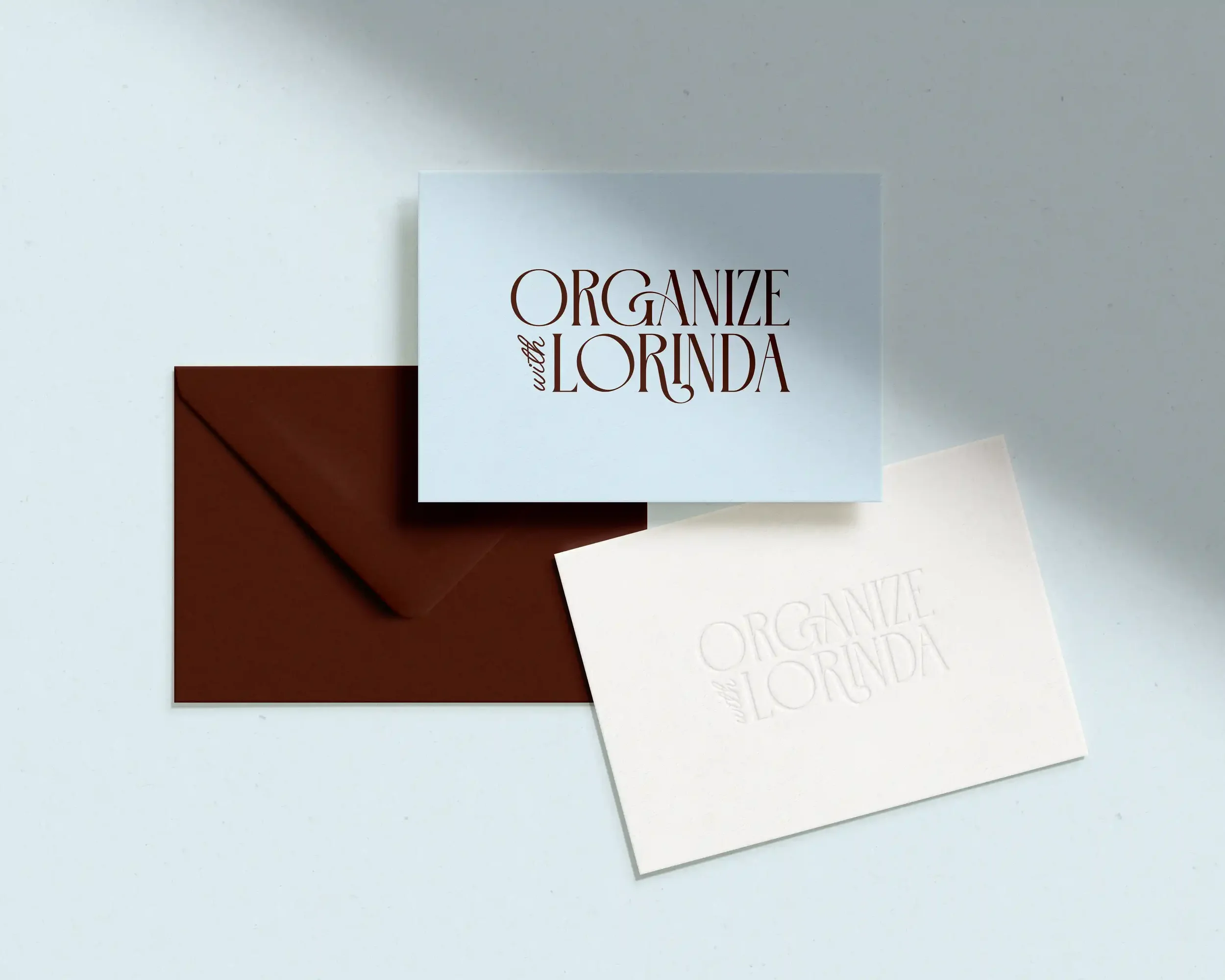
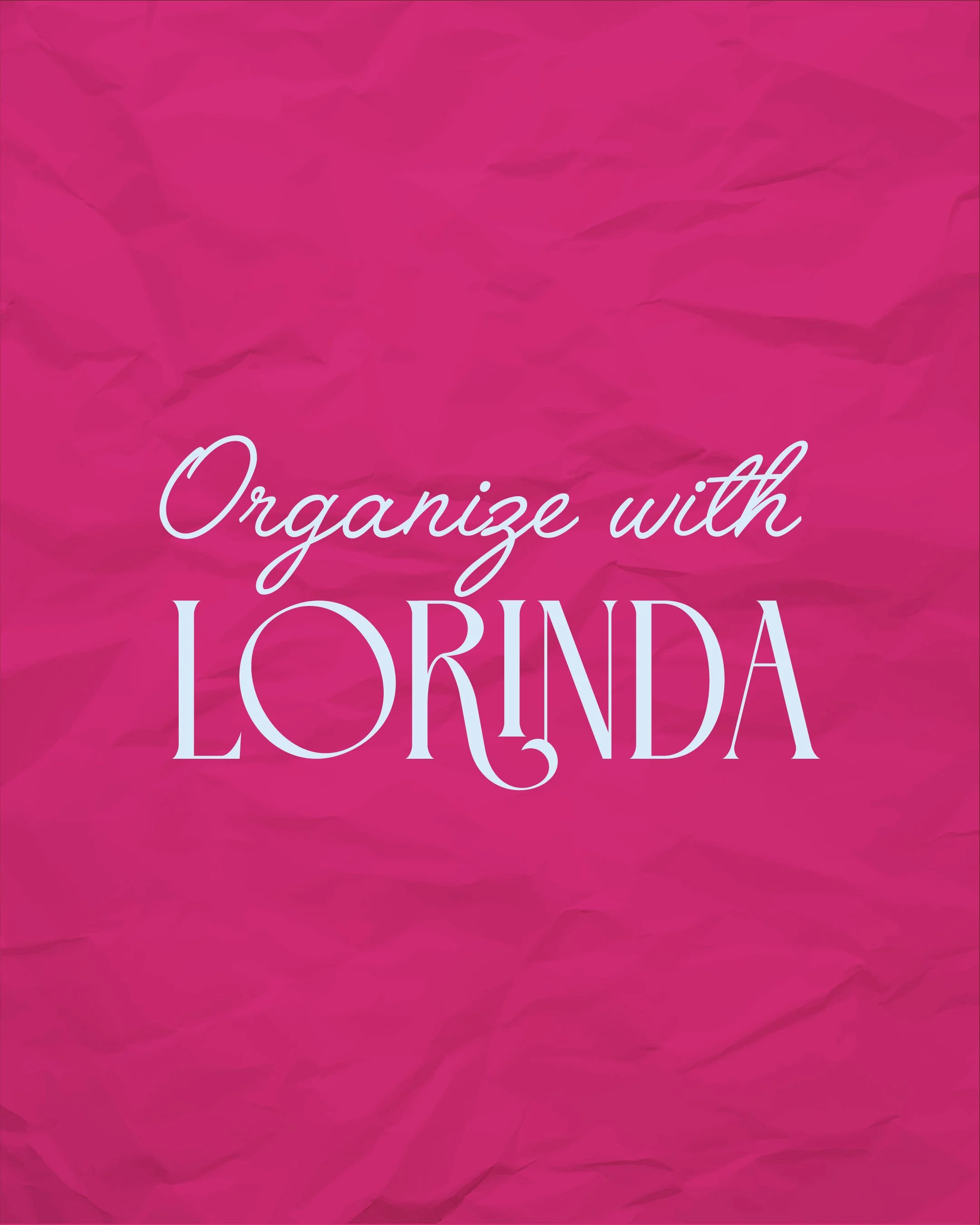
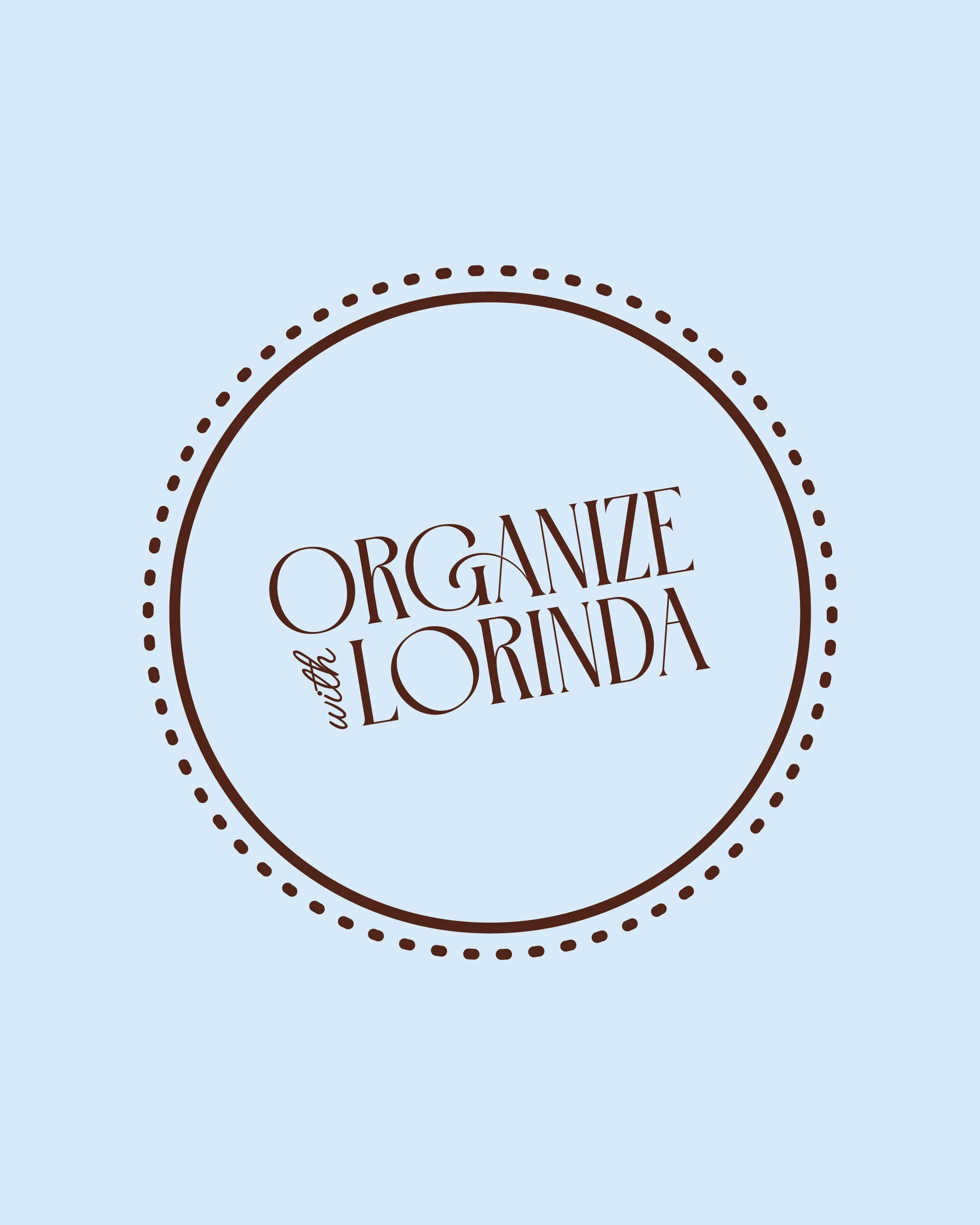
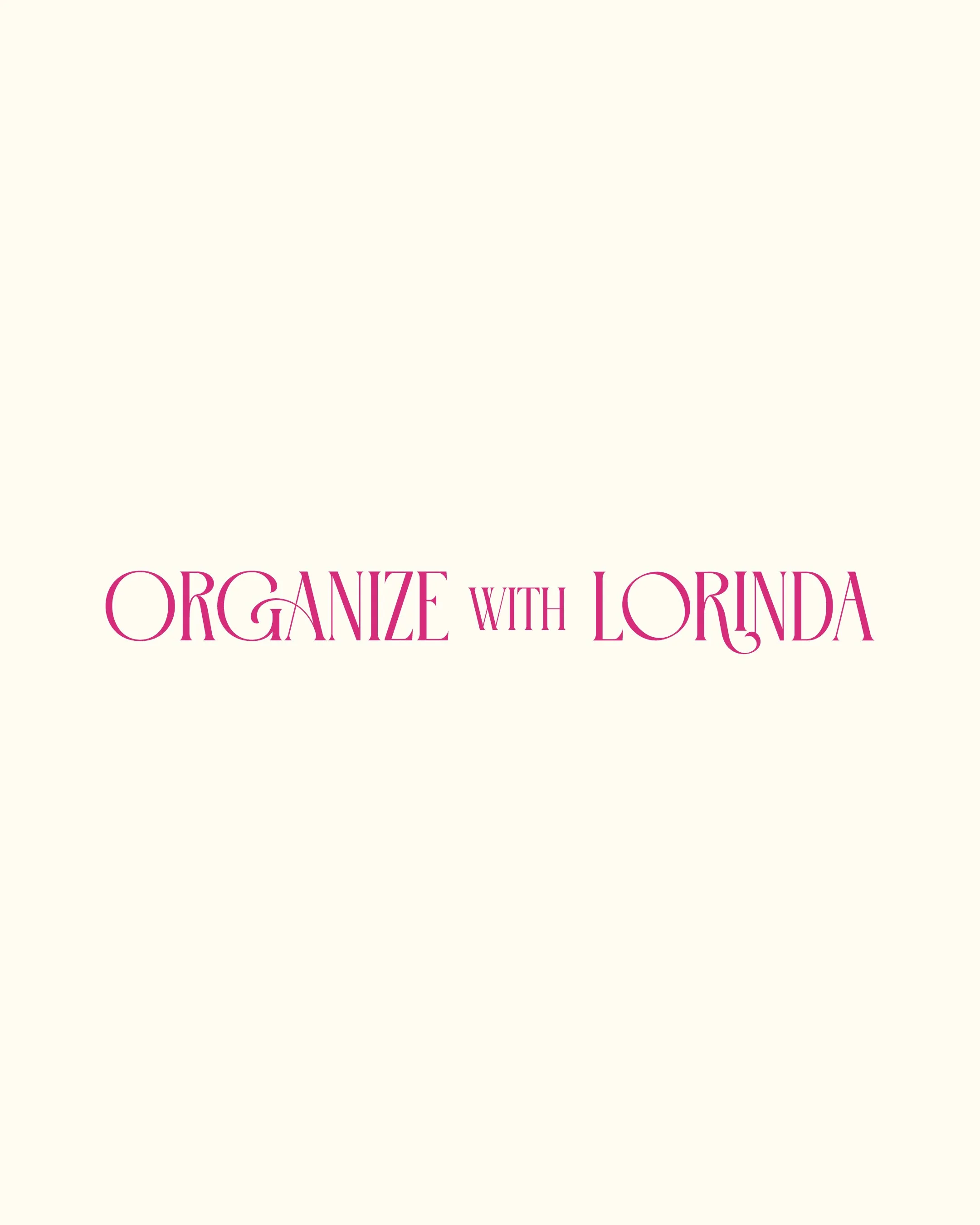
The logo pairs an elegant serif with a script "with," sophisticated enough to signal expertise, human enough to feel like a friend. The palette of chocolate brown, dusty pink and soft blues was built to feel calm and grounded, because that's exactly what Lorinda's clients are searching for when they find her.
Asking for help is brave. This brand makes it feel possible. 🤎
KIND WORDS:
"What you created is so much more than a design. It's art. It's a story. It's me. I am absolutely overjoyed."
Lorinda