
Why Your Brand Needs to Do More Than Look Good
The strategy behind Organize with Lorinda
— and what it means for your business.
Here’s something I want you to sit with for a second: a beautiful logo doesn’t build trust. A pretty colour palette doesn’t make someone feel safe enough to reach out. And a trendy font definitely doesn’t communicate your expertise.
What does all of that? Strategy. Story. Intention.
I know that sounds like something every designer says. But let me show you what it actually looks like in practice, because I think once you see it, you’ll never look at branding the same way again.
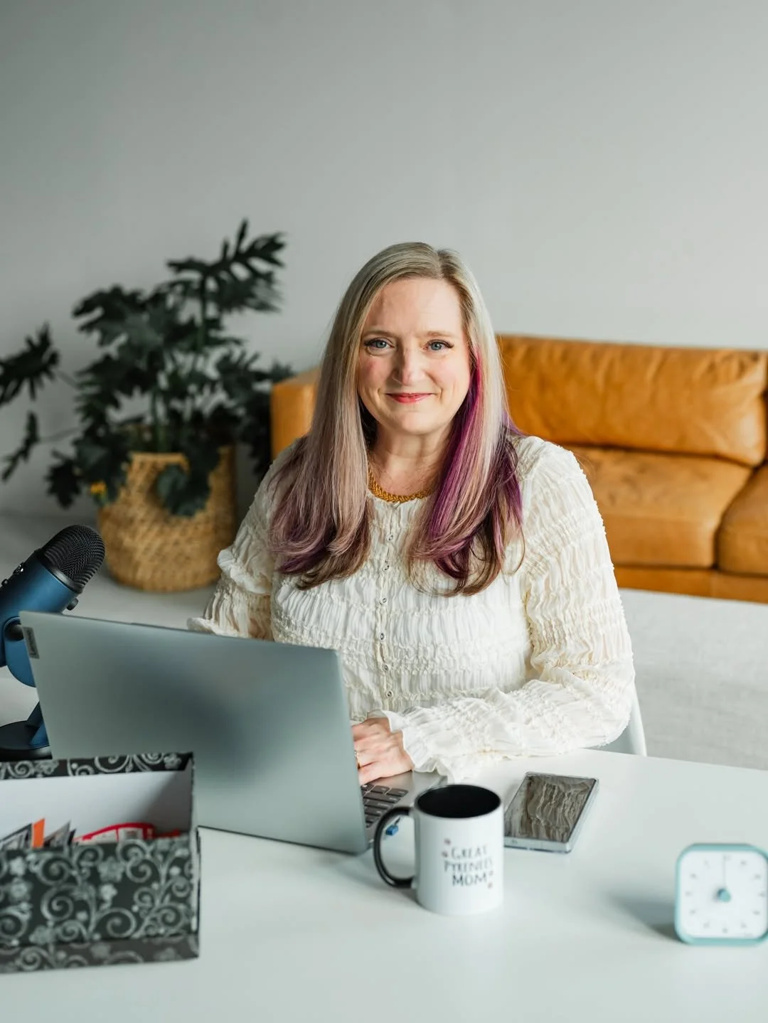
Meet Lorinda
Lorinda is a registered nurse with over 30 years of experience. She’s also an ADHD Organising Specialist, which means she works with women who are overwhelmed, often carrying quiet shame about the state of their homes, and desperately looking for someone who gets it.
She came to me knowing she needed a brand. What she couldn’t quite articulate yet was just how much that brand needed to work. Not just look good on Instagram, but actually do something. Signal credibility to the women who needed to know she was the real deal. And at the same time, feel warm and safe enough that those same women, who might be embarrassed to ask for help, would feel comfortable enough to reach out.
That’s a big ask of a visual identity. But that’s exactly what strategy is for.
Why “Looking Good” Isn’t Enough
I talk to so many business owners who think branding is about aesthetics. Pick a colour palette, design a logo, maybe grab some matching Canva templates, and you’re done.
And look, none of that is wrong exactly. But it’s surface level. It skips the most important question: what does your brand actually need to communicate to the right person at the right moment?
For Lorinda, that question had a very specific answer. Her ideal client is a woman who might feel embarrassed about her home. She’s been putting off asking for help. She’s Googling at 11pm, quietly hoping someone out there understands. When she lands on Lorinda’s page, she needs to feel two things almost simultaneously: “this person is qualified and credible” and “this is a safe place and I won’t be judged.”
If the brand only nailed one of those? It wouldn’t work. Too clinical and she’d feel like she was being assessed. Too soft and she’d wonder if Lorinda really knew what she was doing.
That balance is strategy. And getting it right takes more than picking colours you like.
The Decisions Behind the Design
Once the strategy was clear, every single design decision became intentional. Here’s how it played out:
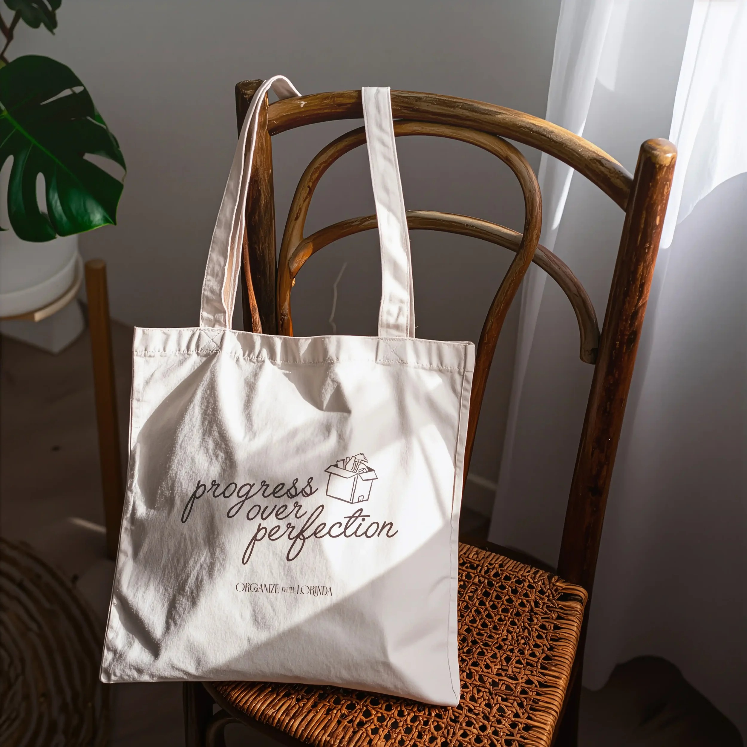
The custom illustrations. A butterfly, dragonfly, vintage key, coffee cup, lamp and box. These aren’t decorative for the sake of it. They pull at something emotional. Because asking for help with your home can feel exposing and vulnerable, and we wanted every visual to quietly whisper ‘you’re safe here.’
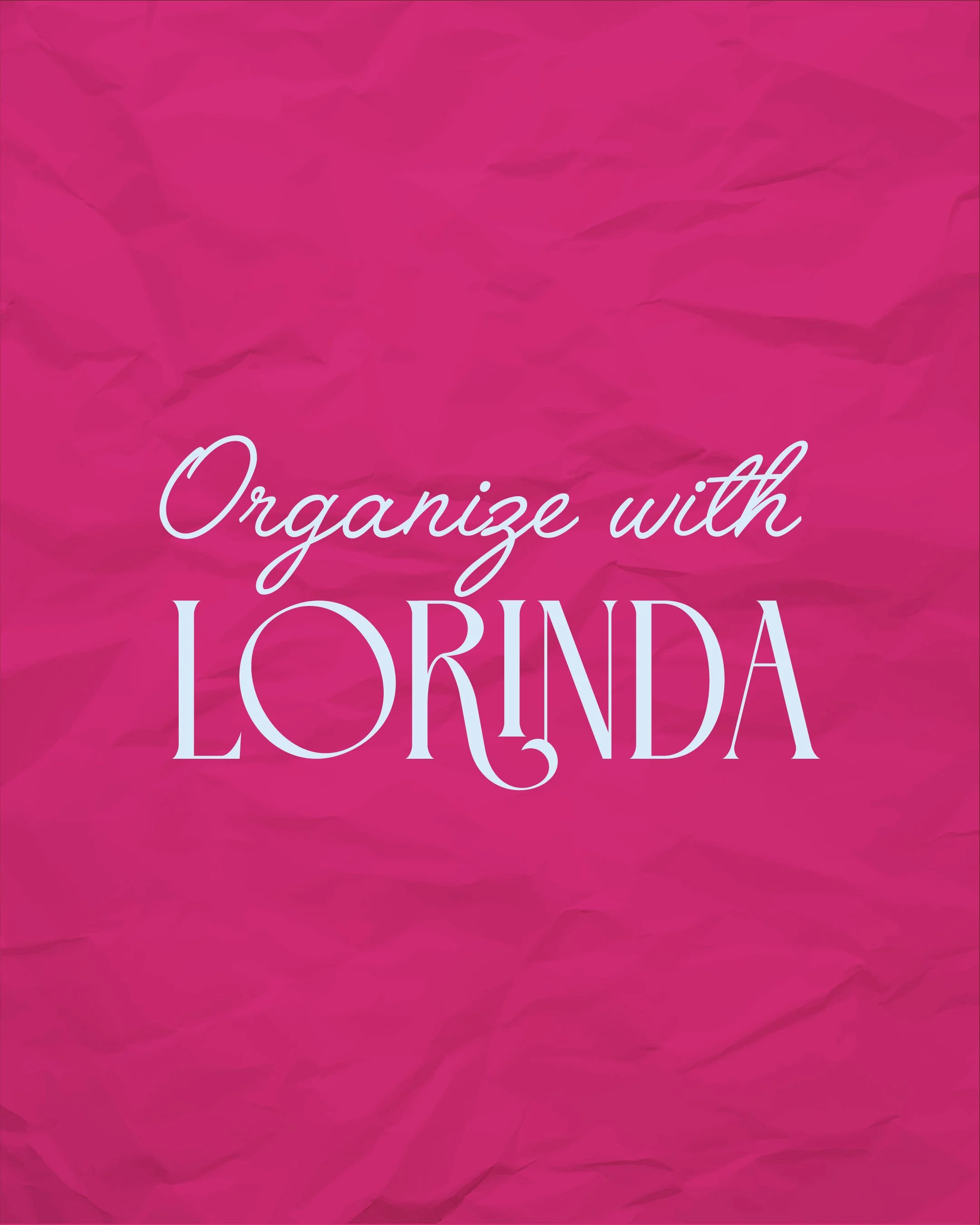
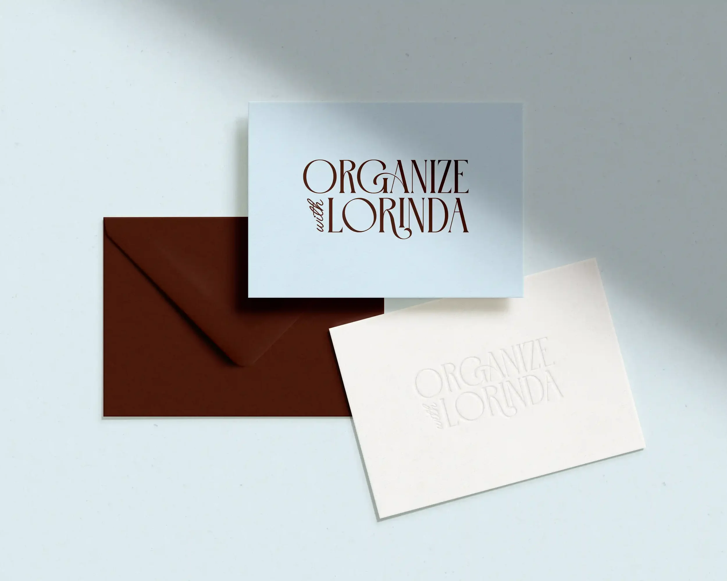
The logo. An elegant serif paired with a script ‘with’. Sophisticated enough to signal expertise. Human enough to feel like a friend. That one word — ‘with’ — does a lot of heavy lifting. It says ‘I’m in this with you.’
The colour palette. Chocolate brown, hot pink pink and soft blues. Calm. Grounded. Warm. Because that’s exactly what Lorinda’s clients are searching for when they find her.
None of these were random choices. Each one was made in service of the person on the other side of the screen.
What Lorinda Said After
This is the part that honestly makes me tear up a little. Lorinda said the process got her thinking about herself and her business in a whole new way. That somehow we were already in her head, taking everything she’d been imagining and dreaming of and making it real.
“What you created is so much more than a design. It’s art. It’s a story. It’s me. I am absolutely overjoyed. I am so thankful I found you!”
She also said she now has so much more confidence, and that her business truly represents her. That’s the transformation I’m always chasing. Not just a brand that looks great, but one that makes you proud to show up.
What This Means For You
If you’ve been putting off getting your branding sorted because you’re not sure it’s ‘worth it yet’, I want to gently challenge that.
Your brand is the first thing a potential client sees. It’s the thing that makes them feel either ‘yes, this is for me’ or ‘actually, never mind.’ And if it’s not doing that job, it’s not just neutral. It’s actively working against you.
The good news? It doesn’t have to be a massive, overwhelming investment to get this right. That’s exactly why The Prologue Collection exists.
Ready to Write Your Next Chapter?
The Prologue Collection is for businesses who are ready to stop DIYing and work with a designer for the first time. Mini brand and website packages built with the same strategic thinking you’ve just read about, just scaled to where you’re at right now.
Because your brand should feel like you. And it should work just as hard as you do. 🤎
Head to The Prologue Collection to find out more or apply today.